Cover Band
The Beatles were an influential band, but not just musically. The look of their albums also had a big effect. At least half their covers are iconic.
So let's rank this aspect of their albums--the original 12 British albums made while they were a going concern. This means no Magical Mystery Tour, which was not released as an LP in Britain till after the band broke up. I'm also not including the Beatles Oldies collection in 1966 that took a bunch of hits not previously on their albums. Neither one of them would have ranked very high.
Also, just the cover, not the back or anything inside.
1. Rubber Soul -- A very nice portrait of The Beatles looking their best, done as an elongated photo (a look discovered by chance by the group, which they then demanded for the cover). Also, the first time their name wasn't on the front.
2. Sgt. Pepper's Lonely Hearts Club Band -- It shouldn't work, but it does. They went all out, with a colorful cover that features a whole bunch of people the band admired, not to mention The Beatles themselves dressed in uniforms, as well as an earlier version of the lads, and a lot of flowers. So much from the psychedelic era has dated, but this is still lovely.
3. The Beatles (aka "The White Album") -- After the super-busy Sgt. Pepper, The Beatles go in the opposite direction, with an all-white cover and the most basic title possible. There's an embossed "The Beatles" and also each edition (for the first few million anyway) stamped with an individual number.
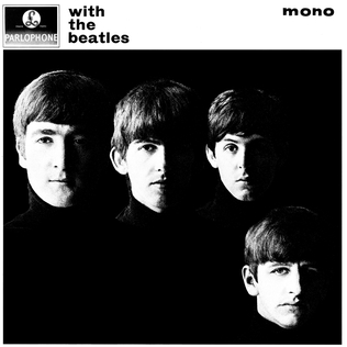
4. With The Beatles -- Their first arty cover, with their faces in half-shadow (and poor Ringo down at the bottom right while the other three are on top). Inspired by previous photos of the boys by Hamburg pal Astrid Kirchherr, it's elegant and tasteful.
5. Abbey Road -- It was going to be a big production. They were thinking of calling the album Everest and doing a photo session in the Himalayas. Then they said screw it, let's just go outside and take some shots. Many have discussed the symbolism of the photo, but who cares--it's the Beatles walking across the street outside the studio, and it looks cool. Also, they decided to dispense with both the title and their name, because this is the group's new album and they're so famous you'll figure it out. This is probably their most copied cover, especially if you include the countless fans who have taken their photos at the same spot.
6. Please Please Me -- EMI didn't know what it had, so it looks like any other album of the time, with the band's name written in big letters, plus the promise of their two hits and 12 other ditties inside. But it's nice to have a conventional cover (made with presumably little input from the band) not to mention the lads looking down from the same stairwell they'd use for a photo just before they broke up as a comparison shot. (Originally they were going to the zoo for their first album cover, planning to get a shot outside the insect house.)
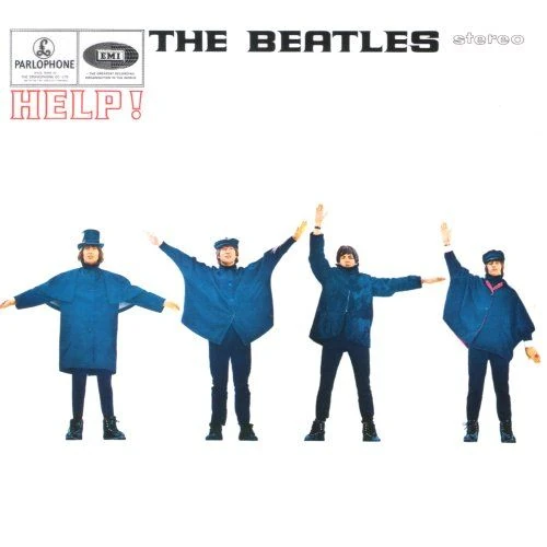
7. Help! -- The band apparently spelling out "HELP" in semaphore. That it's actually "NUJV" makes it even better
8. A Hard Day's Night -- Nothing too special, but still it's nice to have 20 separate shots of the Beatles (somewhat taken from the movie).
9. Revolver -- Created by their pal from Hamburg Klaus Voormann, it's considered a classic. Well, the album is, but I've always considered this collage a bit of a mess.
10. Beatles For Sale -- They look tired, and the four standing next to each other with nature behind them is done so much better on Rubber Soul
11. Let It Be -- It's the four Beatles, each in a separate box, each looking very different. While you can't go wrong with that, it's not a great collection of shots, and they don't fit together well.
12. Yellow Submarine -- I love the movie, but the cover just looks like an ad.


1 Comments:
While I don't always agree with your music rankings, I agree with this 100%. Except maybe I'd switch 3 and 4.
I slightly prefer the blue tone of the Meet the Beatles cover over the black-and-white With the Beatles cover, but the missing necks were creepy.
I actually saw the cover of Meet the Residents before either of these. (My friends didn't have any Beatles LPs earlier than "Rubber Soul"; everything earlier we learned from the Red Album and the radio.)
Post a Comment
<< Home